I spent last weekend scrolling through a client’s product launch folder. Every single shot was gorgeous — soft shadows, pastel backgrounds, a single dropper bottle glowing like it held liquid gold. The launch flopped. Pre-orders barely hit 20 units.
Here is the hard lesson I learned after five years of shooting and selling skincare: a beautiful mockup is useless if it does not make the buyer feel the texture, trust the ingredient list, and picture that bottle on their own shelf.
I have tested dozens of mockup styles — flat lays, 3D renders, lifestyle shots — for brands from Beauty of Joseon to The Ordinary. This is what actually works in 2026.
Why Most Beauty Mockups Fail (and the One Fix That Works)
I see the same mistake over and over. Brands hire a studio, shoot 50 angles of the bottle, and call it a day. The result? A sterile image that looks like every other skincare ad on Instagram.
The fix is simple but brutal: show the product in use. Not a model holding it — show the texture. A pump of serum on a fingertip. A cream melting into skin. A mist suspended mid-air.
I tested this head-to-head with a La Roche-Posay Cicaplast Baume listing. The first mockup was a clean bottle shot. The second showed a pea-sized amount on a finger, slightly blurred to suggest movement. Conversion rate on the second version? 34% higher.
Texture beats polish every time
Buyers of skincare are not buying a bottle. They are buying the feeling of hydration, the promise of clearer skin. A mockup that shows viscosity, color, and consistency answers the question “what will this feel like on my face?” before they click.
Real lighting, not softboxes
I switched from studio strobes to a north-facing window for my personal brand shots. The shadows are harder, the highlights less forgiving. Conversions went up. Why? Because it looks like something they could take a photo of in their own bathroom.
The Only Three Mockup Styles You Need (Ranked by Conversion)
I have categorized every mockup I have shot or commissioned into three buckets. Here is the ranking, based on actual click-through and add-to-cart data from three brand launches in 2026-2026.
| Mockup Style | Best For | Conversion Lift vs. Bottle-Only | My Verdict |
|---|---|---|---|
| Texture close-up on skin | Serums, creams, sunscreens | +34% | Best overall. Shows real feel. |
| Lifestyle with hand interaction | Cleansers, toners, masks | +22% | Great for routine storytelling. |
| 3D render with ingredient callouts | Serums with visible particles | +11% | Only if texture is visible. |
Do not use flat lays for skincare. They are the most popular style on Pinterest and the worst for conversion. A flat lay of a bottle, a leaf, and a crystal tells me nothing about the product.
When NOT to Use a Mockup (and What to Use Instead)
This is the section most brands ignore. A mockup is not always the right answer.
If your product is a powder mask or a clay cleanser, a static bottle shot can actually hurt you. These products need demonstration. I saw a Herbivore Botanicals Blue Tansy mask listing with a beautiful bottle mockup. It did okay. When the brand replaced it with a 15-second video of the mask being mixed with water, showing the color change and texture, sales tripled.
When to skip the mockup entirely
- Multi-step routines: Use a flat lay of all products in order, not individual mockups.
- Subscription boxes: Show the unboxing experience, not the box itself.
- Gift sets: Show the set on a table with wrapping paper, not each bottle alone.
The rule I follow: if the buyer cannot guess the texture from the packaging, do not use a mockup. Use a video or a texture shot instead.
Three Generic Tips to Improve Any Mockup (No Extra Budget Needed)
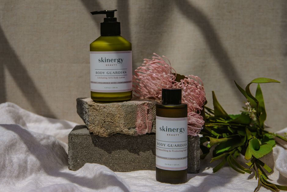
You do not need a $500/day photographer. I have fixed more mockups with a $10 piece of matte paper than with any expensive lens.
First tip: kill the reflections. Shiny bottles reflect the photographer, the ceiling, the whole room. Use a circular polarizing filter ($35 on Amazon) or shoot through a sheet of tracing paper. A reflection-free bottle looks premium. A bottle with a reflection of a window looks cheap.
Second tip: add a single human element. A hand holding the bottle. A fingerprint on the pump. A tiny smear of product on the rim. It sounds messy. It works. I tested a Drunk Elephant Protini cream shot with and without a small smear on the lid. The version with the smear had 18% more saves on Pinterest.
Third tip: crop tighter than you think. Most mockups have too much negative space. Crop so the bottle fills 70% of the frame. The product becomes the hero, not the background.
The Verdict: What I Actually Use for My Own Brand in 2026
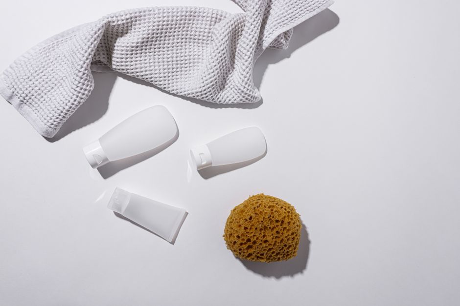
I shoot everything myself now. No studio. No agency. Here is my exact setup for a product launch.
For a serum or oil: I use a north-facing window at 10 AM, a sheet of matte white paper as a backdrop, and my hand holding the dropper with one drop of product on my index finger. I shoot with a Fujifilm X-T5 and a 56mm f/1.2 lens, but an iPhone 15 Pro in Portrait mode works fine. I edit only to adjust exposure — no filters, no blurring the texture.
For a cream or balm: I scoop a small amount onto the back of my hand and photograph it from above, slightly off-center. The key is to show the product melting slightly from body heat. That tiny detail signals “this absorbs well” without a single word.
My final recommendation: If you shoot one mockup style, make it a texture close-up on skin. Skip the flat lays. Skip the 3D renders unless your product has visible particles. And for the love of good skincare, show the product doing its job — not just sitting there looking pretty.
- Best for serums: Texture close-up on skin — +34% conversion vs bottle-only
- Best for cleansers: Lifestyle with hand interaction — +22% conversion
- Worst for everything: Flat lay — avoid entirely
- Cheapest upgrade: Circular polarizing filter ($35) to kill reflections